
Why white paint is never just plain white
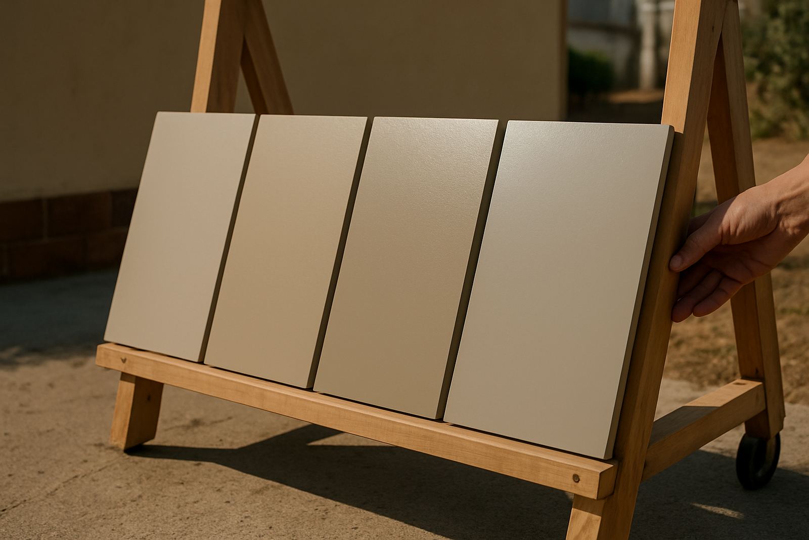
When people ask for white, they often mean clean and simple, but there are many versions of white in paint. Some whites carry a hint of yellow, red or brown and feel softer. Others lean blue, grey or green and look cooler on the wall.
That small shift matters more than most people expect. A white with a warm undertone can suit older homes, timber floors and rooms that do not get much sun. A cooler white can help a modern space feel crisp, especially where you want to show off tiles, steel fittings or artwork.
- Warm whites can feel creamy or slightly ivory.
- Cool whites can feel brighter, cleaner or a bit blue-grey.
- Neutral whites sit closer to the middle and are often safest for mixed lighting.
How South African light changes the look of white
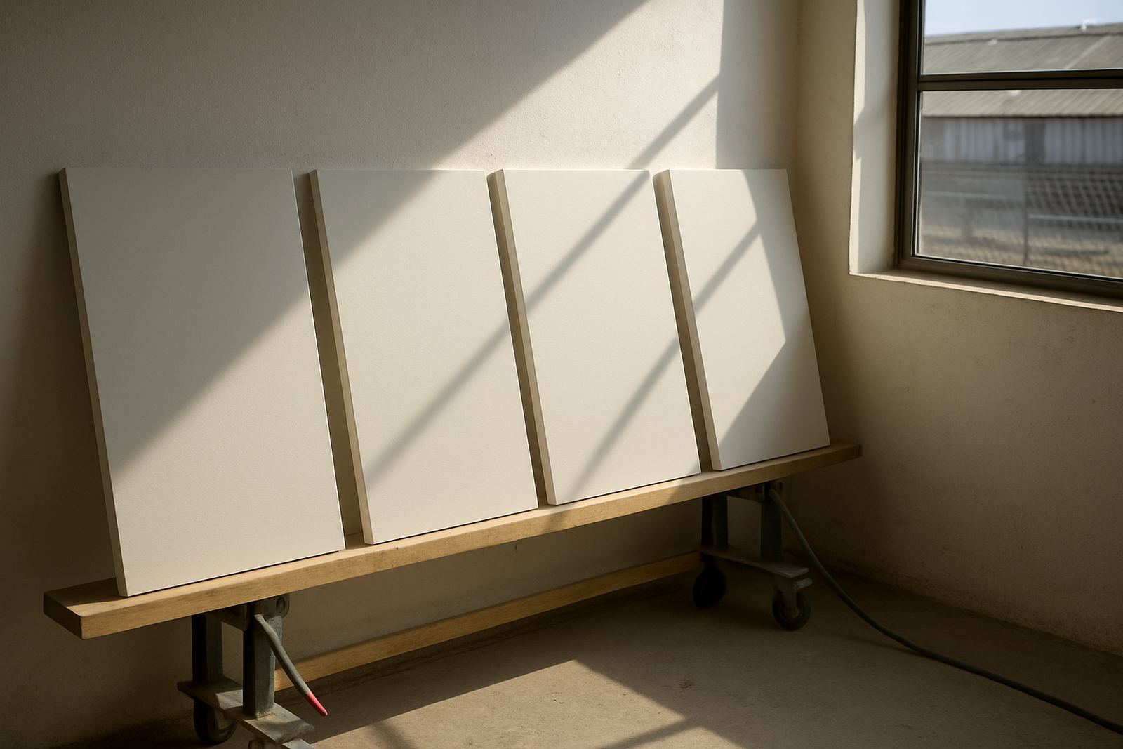
White paint reacts strongly to natural light, and that is easy to see in places like Gqeberha, where coastal light can be bright in the morning and softer later on. A white that looks clean at the counter can turn yellowish on a north facing wall, while the same colour may seem sharper in a shaded passage.
In Joburg homes, especially in Sandton and Randburg, strong sun and glass doors can make cool whites look harsher than expected. In Cape Town, overcast days can make a white feel flatter, so a touch of warmth helps prevent the room from feeling cold and a bit empty.
- South facing rooms often need a warmer white.
- North facing rooms can handle cooler whites better.
- Rooms with LED lighting may shift whiter or bluer at night.
Matching undertone to the room, not just the trend
The best white for a bedroom is not always the best white for a shopfront or an office. The finish, the floor colour and the amount of shade all affect the result. If your room has beige tiles, cream curtains or wood trim, a stark white may look mismatched. If the space has grey floors, polished concrete or black fittings, a warmer white can look muddy.
For repainting, start by asking what needs to stand out. If the answer is the mouldings, the artwork or the kitchen cupboards, choose a white that supports those items instead of competing with them. The right undertone gives you balance, and saves a lot of repainting later.
- Soft white works well with timber, tan leather and older plaster.
- Pure white suits clean lines, glossy tiles and pale stone.
- Off-white can hide wall flaws better than a very bright white.
Testing sample pots the proper way
Sample pots are worth the small spend because white changes a lot once it is on the wall. Paint a patch at least 50 cm by 50 cm on more than one wall and look at it in the morning, midday and evening. If possible, test it next to skirting, cupboards or ceiling cornices so you can see how the undertone behaves beside other materials.
Do not judge it only under shop lights or on a scrap of card. The same white can look crisp in the shade and yellow in the sun. If you are deciding between two shades, ask for a sample pot mix and test both in the actual room. That is the safest way to avoid a finish that feels too cold, or too creamy once the job is done.
A Gqeberha example from a coastal home
A common local case is a family home in Korsten with a front room that gets strong afternoon light and a back corridor that stays shaded. The owner wants one white throughout for a neat finish, but the wrong choice can make the bright room glare and the corridor look dull. In that situation, a soft neutral white usually works better than a very cool white.
At ColouRight Paints, that is where colour matching and practical advice come together. A colour sample can be checked against the wall finish, the timber tone and even the light fitting colour before any large tin is opened. For homes near the coast, a white that handles humidity and frequent cleaning is also worth considering, because walls near windows and living areas need to stay tidy for longer.
Our branch team in Korsten, plus support in Walmer, Newton Park, Sandton, Randburg and Bellville, can help with sample pot mixing, product recommendations and repaint troubleshooting. If you are planning a full recoat, it also helps to work out bulk quantities early so you do not run short halfway through the job.
Simple rules for choosing the right white
If you are standing in front of ten white shades, start with the room conditions and work back from there. Most mistakes happen when the white is chosen first and the light is ignored. A clean result comes from matching the undertone to the space, then checking it again in daylight and evening light.
- Warm white for shaded rooms, older homes and wood-heavy interiors.
- Cool white for bright modern rooms with stone, steel or grey finishes.
- Neutral white for mixed lighting, rentals and spaces with changing use.
- Always test on the wall, not just on a fan deck or small card.
If you are unsure, ask for colour consultation and repaint advice before you start. A well chosen white can make a room feel bigger, tidier and more settled, without looking harsh. Get the undertone right and the rest of the room usually falls into place.