
Warm and Cool Colours Start with Undertones
When people say a colour feels warm or cool, they are usually talking about the undertone rather than the main colour family. A beige can lean yellow and feel warm, or lean grey and feel cooler. The same goes for whites, greys, blues and even greens.
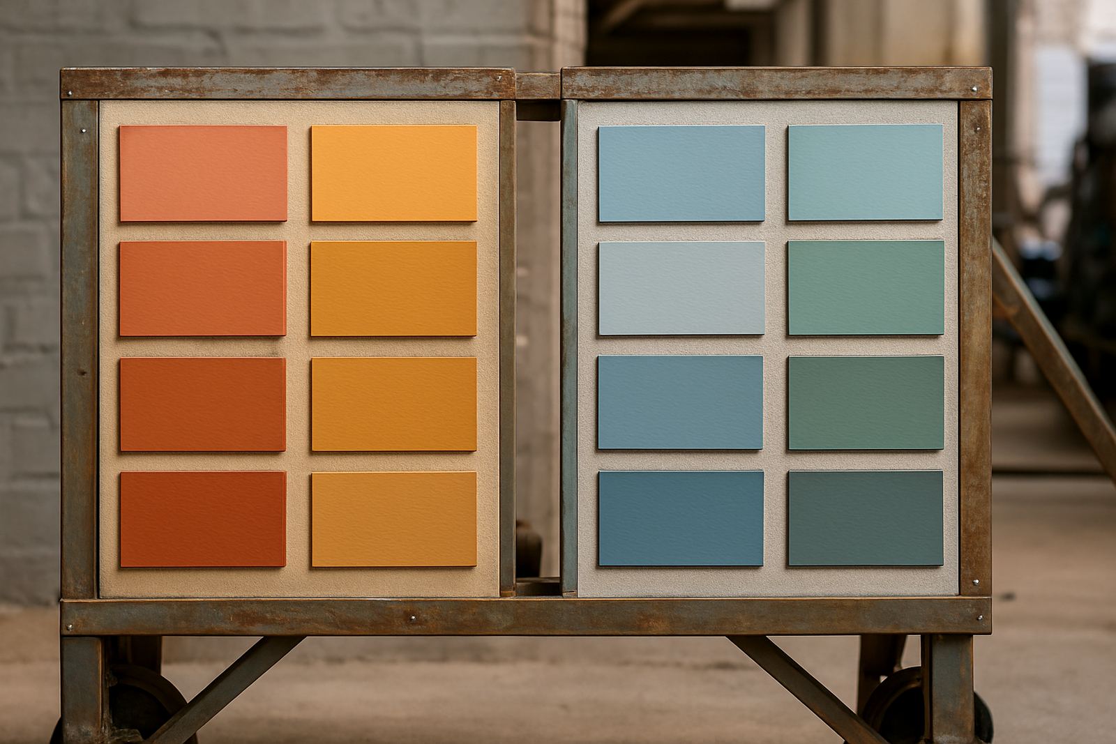
Warm colours usually carry red, yellow or orange notes. Think terracotta, cream, peach, mustard and many earthy neutrals. Cool colours tend to have blue, green or violet notes, so you get crisp whites, icy greys, slate blues and many fresh greens. In Gqeberha, where strong sun and coastal light can shift how paint reads through the day, that undertone makes a bigger difference than many people expect.
A simple way to test it is to hold your sample next to a true white sheet of paper. If the colour suddenly looks yellow, pink or brown, that is the undertone speaking. If it looks cleaner and sharper, it may sit on the cooler side. Small test patches save a lot of regret later, especialy when you are painting a whole lounge or shop front.
How Warm Colours Change the Feel of a Room
Warm colours tend to make a space feel closer, softer and more welcoming. That is why they work well in family rooms, dining areas, hospitality spaces and north-facing rooms that need a bit of visual warmth. They also suit older homes with darker timber, warm stone or natural floor tiles.
Warm tones can help large rooms feel less empty and can make a sparse room feel lived in. If you have a cooler home with lots of glass, tiled floors or strong morning light, warm paint can stop the space from feeling too sharp. In winter, a warm off-white or pale sand can make a room feel more settled without turning it yellow.
- Use warm neutrals for open-plan living areas where you want comfort
- Choose terracotta or clay shades for feature walls in social spaces
- Pair warm paint with timber, rattan and linen for a softer finish
- Test warm shades in both daylight and evening light before buying full tins
What Cool Colours Do Best in South African Homes
Cool colours usually make a room feel calmer, cleaner and a bit more spacious. They are a strong choice for bathrooms, bedrooms, offices, clinics and modern retail interiors where a fresh look matters. Cool blues and grey-greens can also balance hot afternoons on the east coast, especially in rooms that pick up a lot of sun.
Cool colours often work well where you want the walls to sit back and let furniture or artwork stand out. They are also useful in smaller rooms because the eye reads them as slightly more distant. That said, too much cool grey in a shaded room can feel flat, so it needs careful handling. A cool white with a touch of blue may look clean in Sandton, but in a dim Korsten passage it can feel a bit hard.
- Use cool whites for a crisp, modern feel in kitchens and passageways
- Try blue-grey in bedrooms for a quieter mood
- Pick cool green tones where you want a fresh, airy result
- Watch out for cool shades going dull under weak light or heavy overhangs
Match the Undertone to the Job, Not Just the Colour Name
The colour name on the tin only tells part of the story. Two paints with the same name can behave differently once they are on the wall. That is why colour consultation and sample pot mixing matter. A family room in Walmer might need a cream that stays warm but does not yellow, while a contractor office in Bellville may want a grey that looks professional without feeling cold.
Think first about the job the room must do. Do you want it to feel calm, energetic, formal or easy-going? Then consider the fixed items in the space such as tiles, curtains, cabinetry, paving and roof colour. A warm wall colour can fight with a very pink floor tile, while a cool grey can look strange next to strong red brick. Getting that balance right saves repainting later.
At our Korsten base, we often see customers bringing in offcuts of tile, curtain fabric or a cabinet door for matching. That is a smart move because the eye compares everything at once, not in isolation. Colour should support the room, not argue with it.
How Coastal Light, Load-Shedding and Surface Prep Affect Colour
South African conditions matter. Coastal humidity can deepen some colours and make others dry a little slower, while strong sunlight can wash out pale shades. In Gqeberha and Cape Town, cooler light can sharpen blues and greys, so a colour that looked soft indoors may read much colder outside.
Load-shedding also changes how a room feels. Under LED bulbs, warm colours can become richer and cooler colours may lose their edge. Under older lamps, some greys can pick up a green or blue cast. That is why sample testing at different times of day is worth the effort.
- Test on the actual wall, not just on loose paper
- Check morning light, afternoon light and artificial light
- Prime properly so old colour does not affect the new result
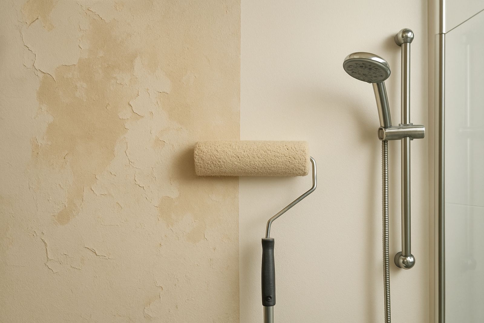
- Ask about surface prep advice if the wall has powdery plaster, damp marks or patch repairs
Using Warm and Cool Colours in One Scheme
You do not have to choose only warm or only cool. Many of the best interiors combine both. A warm wall colour can sit nicely with a cooler trim, or a cool grey room can be softened with warm timber, brass or fabric. The trick is keeping the undertones related, not fighting each other.
A practical rule is to use one main family and one support family. For example, a warm beige wall with a slightly cooler white ceiling can feel balanced, while a cool blue-grey room with a warm rug and timber side tables can feel settled. This works well in homes that mix old and new finishes, which is common in Joburg and Cape Town where renovations happen in stages.
For trade clients planning bulk quantity orders, consistency is just as important as style. Once the undertone is set, record the formula and keep the batch details handy for future touch-ups. That makes repaint troubleshooting much easier when a wall needs more paint six months later.
A Simple Way to Decide Before You Buy
If you are stuck between warm and cool, start with the room conditions and the mood you want. Then narrow it down with samples and a small test area. The goal is not to chase a perfect colour on a fan deck. It is to find a colour that works in your room, with your light, your finishes and your daily use.
At ColouRight Paints, we help customers compare undertones, mix sample pots and plan the right quantity for the job, whether it is a single bedroom or a full repaint. If you are unsure, bring in your tile, fabric or cabinet sample and we can talk through the options before you spend on full tins.
A little time on colour choice often saves a full repaint later. That is money well kept in your pocket.