
Why the same paint looks different from room to room
Paint is never seen in isolation. It sits beside tiles, timber, curtains, paving and furniture, then shifts again as the light changes through the day. A soft grey that feels calm in a north facing room at 9 am may look almost blue by late afternoon, while a cream can turn yellow in a shaded passage or under warm bulbs.
This is why colour matching is only part of the job. At ColouRight Paints in Korsten, we always look at where the room faces, how much glass it has and whether the area gets full sun, broken shade or reflected light from nearby walls. In coastal areas like Gqeberha, glare from bright skies can make pale colours seem sharper. In Joburg, stronger sun and longer winter shadows can change the same wall in a matter of hours.
- North facing rooms usually get stronger light for more of the day.
- South facing rooms often stay cooler and can make colours look darker.
- East facing rooms get bright morning light that fades by noon.
- West facing rooms often look warmer in the afternoon and early evening.
Morning light gives colours their first test
Morning light is useful because it shows you how a colour behaves when the room is fresh and the sun is still soft. This is the time many homeowners in Walmer or Newton Park first notice that a neutral chosen in a shop can look completely different at home. Morning light tends to be clearer and cooler, which can bring out blue, green and grey notes that were not obvious before.
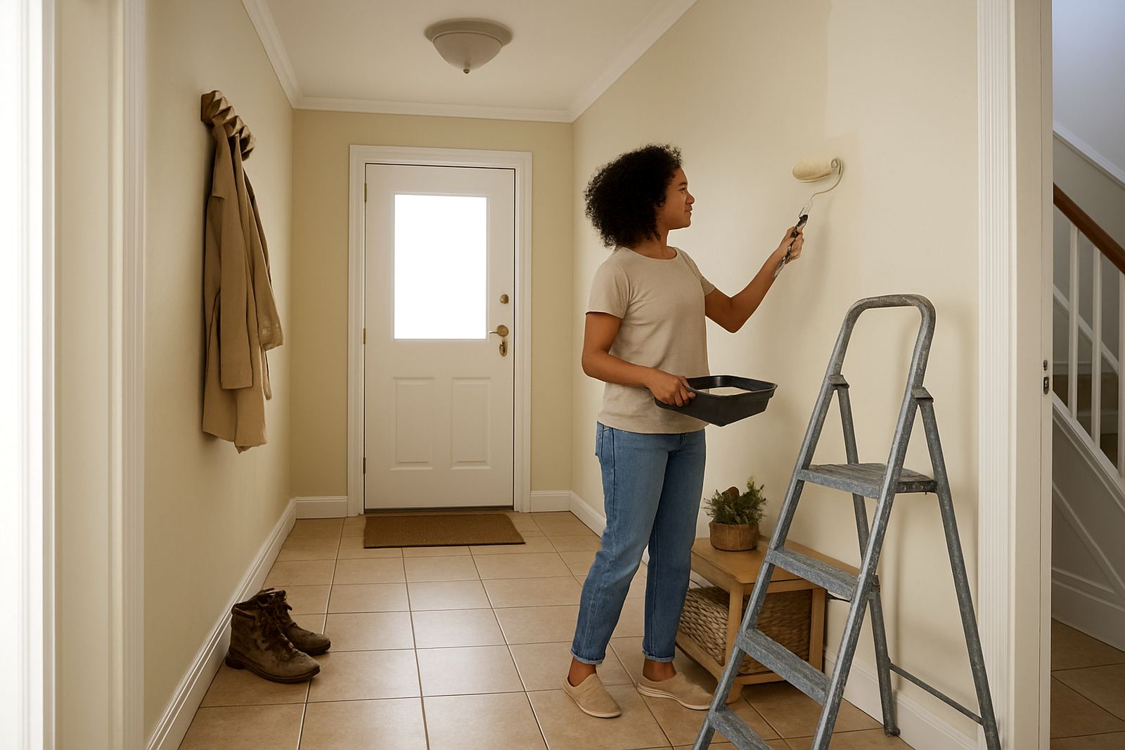
If a room is used early, such as a kitchen, reception area or school office, you should test the paint where the sun first lands. That will show whether the colour feels too stark for everyday use or whether it settles nicely once the space warms up. Do not judge a sample from a single patch near a window, because reflected light from floors and outside walls can fool the eye.
- Check samples before curtains are fully open and again after sunrise.
- Place test patches on more than one wall, not only next to the window.
- Compare the sample with the ceiling and skirting, not just the wall colour.
- Use a sample pot, not a tiny card, so you can see the true depth.
Afternoon sun can warm up or wash out a finish
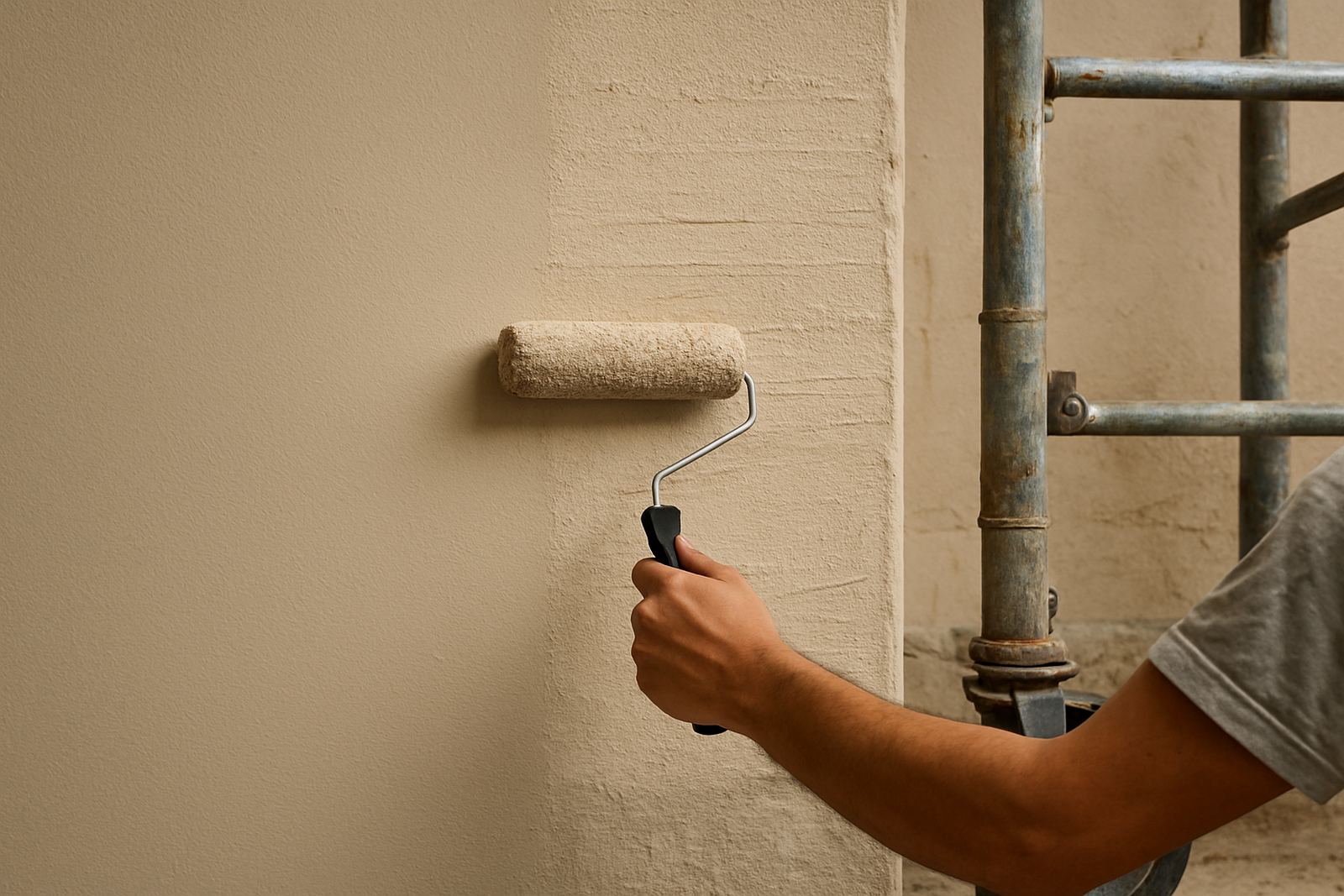
Afternoon light is often stronger and more direct, especially in west facing rooms and on exterior walls. This is where many colours start to surprise people. Creams can go richer, whites can look sharp and some greys pick up a brown or green cast. On outside walls, the colour may appear lighter than expected during peak sun, then deeper again once the shade returns.
For homes in Bellville or Randburg, where rooms can get hard afternoon light through bigger windows, it helps to test both matt and low sheen options. A matt finish can soften glare, while a low sheen can be easier to wipe down in busy family areas. For exterior work, always check the finish in full sun and in shade because the same shade can read two tones apart. That is not a fault, its simply how light works on pigment.
Afternoon testing also matters for businesses. A waiting area or showroom may look perfect at 10 am but too bright by 3 pm. If you are ordering trade quantities, ask for advice on how the colour will behave across the whole day, not only under one light source.
Shaded areas need a different eye
Shade changes everything. A colour that works in open light can look muddy in a courtyard, under an overhang or in a south facing passage. In older buildings and in coastal suburbs, shaded walls often sit beside bright outdoor surfaces, which makes the contrast even stronger. The eye reads the wall against the brighter area and the colour can seem darker than it really is.
For shaded rooms, choose colours with enough body to avoid going flat. Off whites, soft beiges and balanced greys usually work better than very cool pale tones. If a room has limited daylight, avoid guessing from a screen or a small chip. It is better to mix a sample pot and place it where the room gets its best natural light, then compare it after lunch and again near sunset.
- Use warmer undertones in dark or shaded rooms.
- Avoid very blue whites if the room already feels cold.
- Check how the colour looks beside dark floors and heavy furniture.
- In shaded exterior spots, make sure the chosen paint still reads clearly from the street.
Coastal humidity and bright skies change the job
In Gqeberha, coastal humidity and bright reflected light can change both the look and the performance of a paint. Pale colours may appear cleaner outdoors, but interior walls near open doors can hold a different cast because of moisture and strong daylight. A soft blue that looks fresh in the morning may seem greener by afternoon, while white can pick up a slight grey tone in damp rooms.
This is why colour consultation should include the conditions of the building, not only the colour family. A bathroom near the coast may need a different finish from a dry interior office in Sandton. Surface prep matters too. If walls are chalky, patched poorly or not fully dry, the colour will not sit evenly and the light will show every flaw.
At our Korsten base, we often help customers compare colour choices for homes in Walmer, shops in Newton Park and trade jobs that need repeat batches across several rooms. The aim is to keep the colour consistent while still allowing for the way local daylight changes from site to site.
How to test paint before you commit
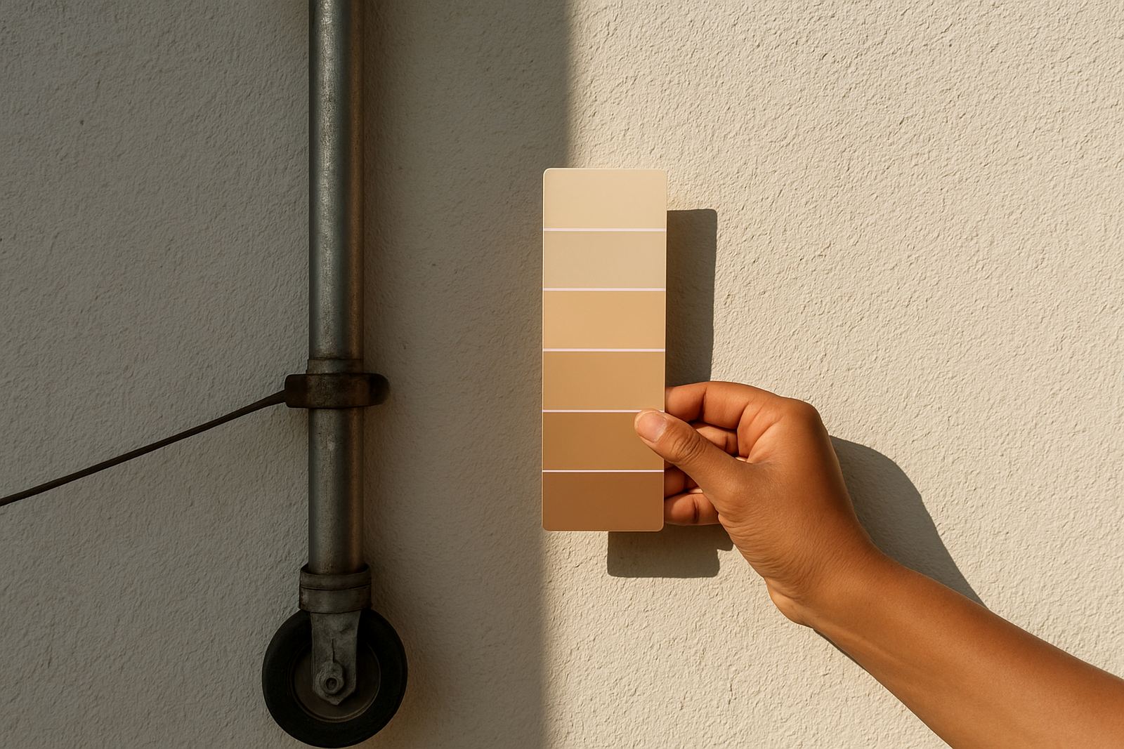
The safest way to choose a colour is to test it where it will actually live. A sample pot can save time, money and a lot of repainting later. Brush out a decent sized patch, let it dry fully and then check it at different times of day. Many people stop after the first look, which is usually the least helpful one.
When you are testing, treat the room as it will be used. Put lights on in the evening. Close the blinds if they are usually shut. Open the curtains if they are normally open. If the area gets load shedding, check how the wall looks under backup lighting too because LED colour temperature can shift a warm neutral into something much cooler.
- Paint a test square at least 500 mm wide.
- Let the sample dry fully before making a decision.
- View it in morning, afternoon and artificial light.
- Keep notes on the exact wall and time, so you can compare fairly.
A local example from Korsten to Cape Town
A common request we handle in Korsten is for a colour that works in one room at home but also carries through into a north facing office or a shaded corridor. A customer may want a calm neutral for a family home in Gqeberha, then discover the same shade looks too cool in a Cape Town branch with more cloud cover and softer daylight. That is not unusual. The light in each place tells a different story.
For this reason, we often suggest a small adjustment rather than a total change. A grey may need a warmer base. A white may need a touch more cream. A beige may need a cleaner tint to stop it looking dusty in shade. The best result is usually the one that looks right at 8 am and still feels comfortable at 4 pm. That balance saves repainting later and keeps the finish looking right for longer.
If you are planning a repaint, ask for colour matching, sample pot mixing, surface prep advice and product recommendations all at once. It is the easiest way to line up the colour with the actual light in your space.