
Why colour matters in a working space
Office colour is not only about appearance. It affects how a room feels at 8am, how long staff stay comfortable through the day and whether a client walks in and sees order or clutter. A pale, well chosen wall colour can make a small office in Korsten feel bigger, while a heavy dark tone can suit a boardroom if the light is right and the furniture is balanced.
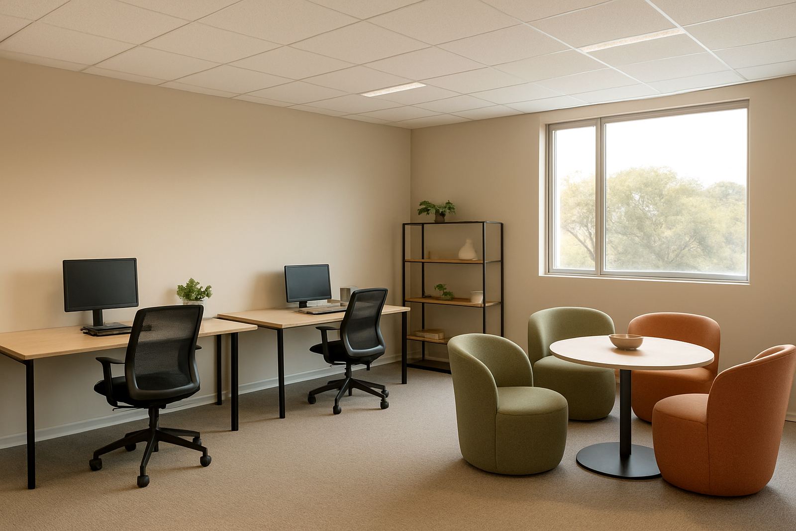
In practical terms, colour helps direct attention. Calm neutrals reduce visual noise, softer greens can take the edge off a busy admin area, and carefully used accent walls can give a reception area a more settled finish. The key is not to overdo it. Most productive offices work best with one main wall colour, one supporting trim colour and a limited accent palette.
Colours that support focus, calm and clean presentation
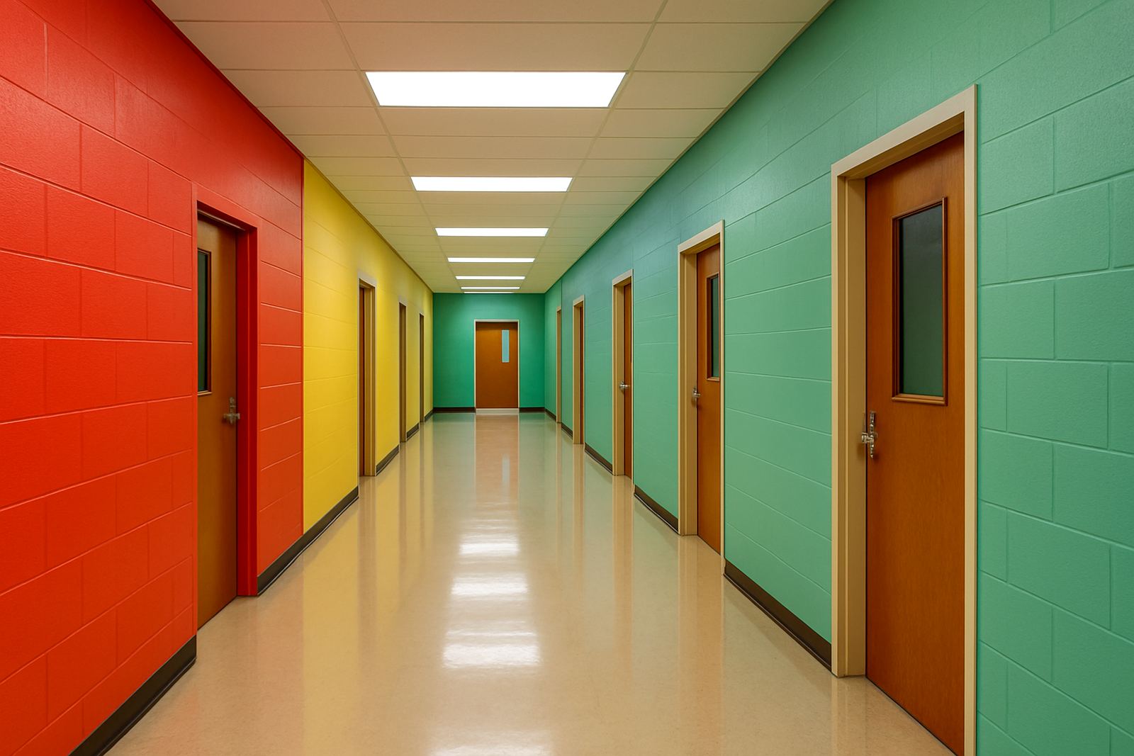
For day to day office work, colour should support concentration rather than compete with it. Strong reds and bright oranges can feel energetic, but in a small open plan area they may become tiring. Cooler tones and muted naturals often work better where staff spend long hours on admin, calls or planning.
- Soft white or warm off white for a neat, bright finish
- Light grey for a modern look that hides minor marks better than pure white
- Pale blue for quieter spaces where clear thinking matters
- Muted green for meeting rooms and support areas
- Clay, beige or stone shades for a welcoming but professional feel
If the office faces strong sun, especially in Gqeberha or Cape Town, colours can look lighter during the day and flatter at dusk. Always test sample pots on more than one wall before placing a bulk order. A shade that looks calm in a shaded room can appear washed out in full sunlight.
Matching colour to the way the office is used
Different spaces need different colour behaviour. A reception area should feel tidy and easy to read, while a manager’s office may need more privacy and less glare. Meeting rooms benefit from low distraction colours, especially if there are screens, printed reports or presentations on the walls. For training rooms and shared work areas, a balanced neutral base keeps things practical and easy to maintain.
Colour also needs to fit the business type. A legal office, accounting firm or medical practice usually needs a more restrained palette. A design studio, print room or client showroom can carry bolder accents, provided the base walls still support a clean finish. The aim is not to make every room the same, but to give each area a purpose through colour.
- Reception: light neutral with one calm feature wall
- Open plan admin: soft grey, off white or muted taupe
- Meeting room: pale blue, green or stone
- Boardroom: deeper neutral for a more formal feel
- Storage and back areas: practical washable paint in a mid tone
Paint finish matters as much as the colour
A good colour can still look wrong if the finish is not suited to the room. Low sheen finishes are usually better on interior walls because they reduce glare from windows and overhead lighting. In busy offices, a washable finish is worth the extra rand because it handles fingerprints, chair scuffs and regular cleaning better.
For humid coastal areas, surface prep matters as much as the paint itself. If there is old damp, flaking plaster or uneven previous colour, the new finish may look patchy. Before repainting, check for moisture, hairline cracks and chalking. Where an office is near the sea or has aircon running most of the day, use the right primer and allow enough drying time between coats.
A local example from Korsten to Sandton
A small office in Korsten may need a practical refresh after years of mixed wall colours, old signage and patch repairs. In that setting, a warm off white with one soft grey feature wall can lift the space without making it feel clinical. The same approach can work in Sandton, but there the lighting, glass partitions and polished flooring may call for a cooler neutral so the room does not feel too yellow.
ColouRight Paints helps clients compare shades in real light, not only under shop lighting. That matters when a colour has to work in a Gqeberha office with morning sun, a Randburg service area with mixed daylight and artificial light, or a Bellville space where the room is used for both meetings and admin. The right tint can change the whole feel of a workplace, and a small sample on the wall often saves a costly repaint later.
Practical steps before you place the order
Before buying paint for an office, it helps to plan the room in detail. Measure wall areas, note the surface condition and check whether the space needs one coat, two coats or a full repaint with primer. If there are feature walls, signboards or colour zones, work out the order of application so the job runs smoothly and the space can reopen quickly.
- Test 2 or 3 sample shades in morning and afternoon light
- Check whether the walls need filler, sanding or sealing
- Confirm if the paint must be washable or extra durable
- Match the colour to flooring, blinds and furniture
- Plan for after hours painting if staff are working on site
It is also worth planning for load-shedding if the office relies on electric lighting during painting or drying checks. In some cases, a darker tint may show less dust, while a brighter one can help maintain visibility in a low lit room. The main goal is a finish that looks good on day one and still reads well after normal office use.