
Start with the wall that already has a job to do
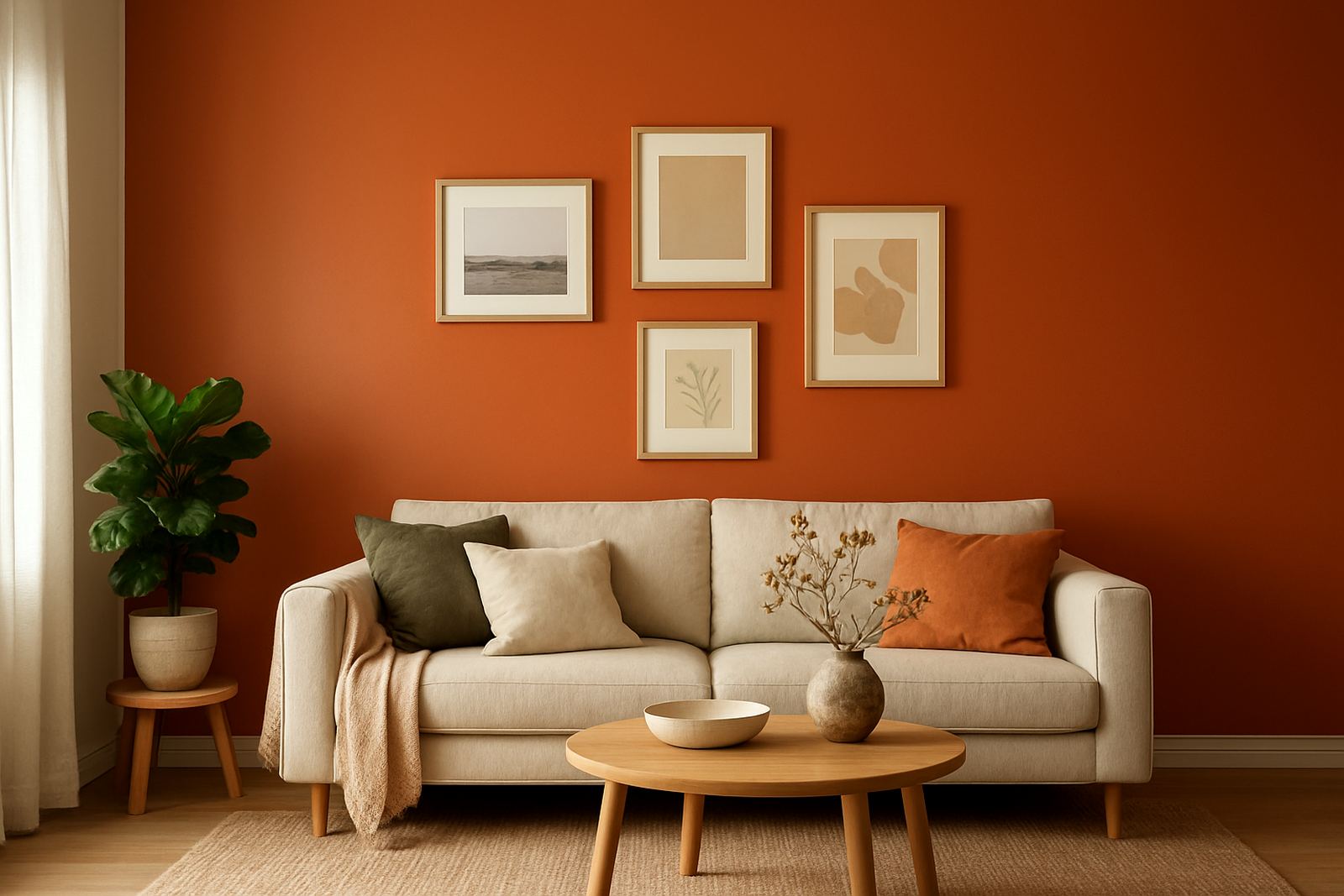
The best feature wall is often the one that already draws the eye, such as the wall behind a sofa, a bed headboard, a reception counter or a dining table. In Gqeberha homes, a wall facing strong afternoon sun can take colour beautifully if the room gets washed-out light, but a wall in deep shade may need a warmer tone to stop it looking flat.
Before you choose a colour, stand back and look at what the wall does for the room. If it has windows, doors, shelves or a TV mounted on it, busy colours can make the area feel chopped up. If it is a plain uninterrupted wall, you have more freedom. For smaller rooms, one feature wall often works better than painting every wall dark.
- Choose a wall with a clear focal point
- Avoid walls already crowded with fittings
- Check the light at different times of day
- Test against flooring, curtains and furniture
Colour choices that add interest without shouting
Strong colour does not always mean bright colour. Deep greens, dusty blues, clay reds and charcoal greys can give a room character while still feeling settled. In coastal areas like Walmer and Cape Town, cooler colours often sit well in bright light, while warmer neutrals can help rooms feel less stark during grey winter days.
If you want a calmer look, choose a tone from the same family as your main wall colour but go two or three shades deeper. That keeps the room linked together. If you prefer more contrast, use a colour that appears elsewhere in the room, maybe in a rug, artwork or scatter cushions. This is where proper paint matching helps, especially when you need the wall colour to work with existing finishes and not fight them.
- Use a deeper version of your main wall colour for a softer effect
- Borrow colour from a fabric, artwork or tile
- Try earthy tones for a grounded feel
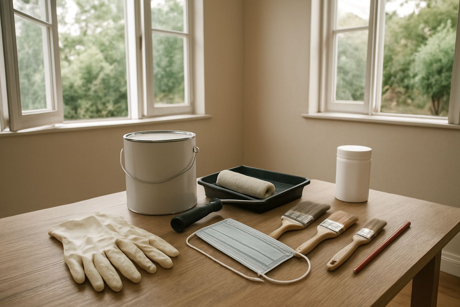
- Use test pots before committing to litres of paint
Finish matters as much as the colour
A feature wall does not need a glossy finish to stand out. In fact, too much shine can show every ripple and patch in the plaster. For most living spaces, a good quality matt or low-sheen finish gives enough depth without drawing attention to small flaws. In kitchens or passages where marks happen often, a washable low-sheen option is usually the better call.
Coastal humidity can change how paint behaves, especially on exterior feature walls or shaded internal walls near open windows. If the wall has had damp before, the prep and primer matter more than the colour. A beautiful shade on poor prep will still look wrong, no matter how carefully it is mixed.
- Matt for a soft, calm look
- Low-sheen for easier cleaning
- Specialist primer where the surface is stained or repaired
- Moisture control first, paint second
Pattern, stripes and painted shapes for a quieter feature wall
A feature wall does not have to be a single block of colour. Simple painted shapes, wide stripes or a colour panel behind a bed can give interest without overpowering the room. This works well in children’s rooms, home offices and small business waiting areas where you want something neat but not too bold.
Keep the shapes clean and measured. A narrow stripe can look accidental, while a wide band of colour can make a room feel more considered. Use masking tape properly and make sure the surface is dry before you start. If you are working in a rental property or a business premises with municipal or landlord rules, keep the design easy to repaint later.
- Wide horizontal bands can widen a room visually
- Vertical blocks can lift low ceilings a little
- Single panels work well behind beds or seating
- Keep lines level and measure carefully
Local example: a Korsten lounge that needed colour without clutter
A family in Korsten wanted a living room that felt warmer without making the space look smaller. The room had pale walls, a dark sofa and a lot of natural light from one side. Rather than painting every wall a stronger shade, they chose one feature wall in a muted blue-green behind the sofa. The colour gave the room shape, while the other walls stayed light so the room still felt open.
The result worked because the paint was matched to the furniture, not chosen on a whim. The family tested two sample pots first, checked them in morning and late afternoon light, then settled on the softer option. That small step saved them from going too dark. It also made the skirtings and curtain fabric feel tied together instead of competing.
For homes in Gqeberha, Sandton or Bellville, the same rule applies: look at the light, test the sample and make sure the feature wall supports the room rather than taking it over.
Prep and touch-up tips for a finish that lasts
Feature walls show patches quickly because people notice them first. Fill cracks, sand rough edges and wipe away dust before any painting starts. If the wall has old water marks, nicotine staining or uneven repairs, get advice on the right sealer so the marks do not bleed through later. A bit of surface prep can save a lot of repainting, especially in homes where load-shedding means lights show up every roller mark at night.
For contractors and DIY buyers alike, it helps to plan the quantity properly. A feature wall may only need a few litres, but if the colour is strong, coverage can change from wall to wall. Keep a labelled sample tin for future touch-ups. It is a small step, but it avoids mismatches when you need to patch after moving furniture or hanging art.
- Clean and sand before painting
- Seal stains and repairs first
- Keep a sample pot for later touch-ups
- Allow enough drying time between coats
When a feature wall should stay simple
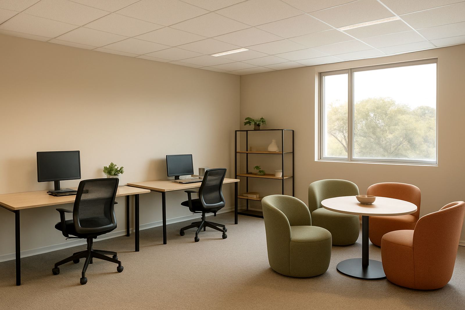
Sometimes the best feature wall is a plain one with a better finish and cleaner lines. If the room already has strong flooring, patterned curtains or busy artwork, adding another bold colour can tip it into clutter. In a small office, reception or consulting room, a quiet colour can still feel intentional if it is well matched and neatly painted.
Think about the use of the room. A family room can carry more personality than a boardroom. A bedroom may need calm, while a retailer might want a wall that highlights product displays without stealing attention from them. A good paint choice supports the space and the people using it, which is often what makes it work long after the first coat dries.
If you are unsure, start with a test patch and live with it for a few days. The right feature wall should feel like part of the room, not a shout from across it.