
Why earth tones work so well in South African rooms
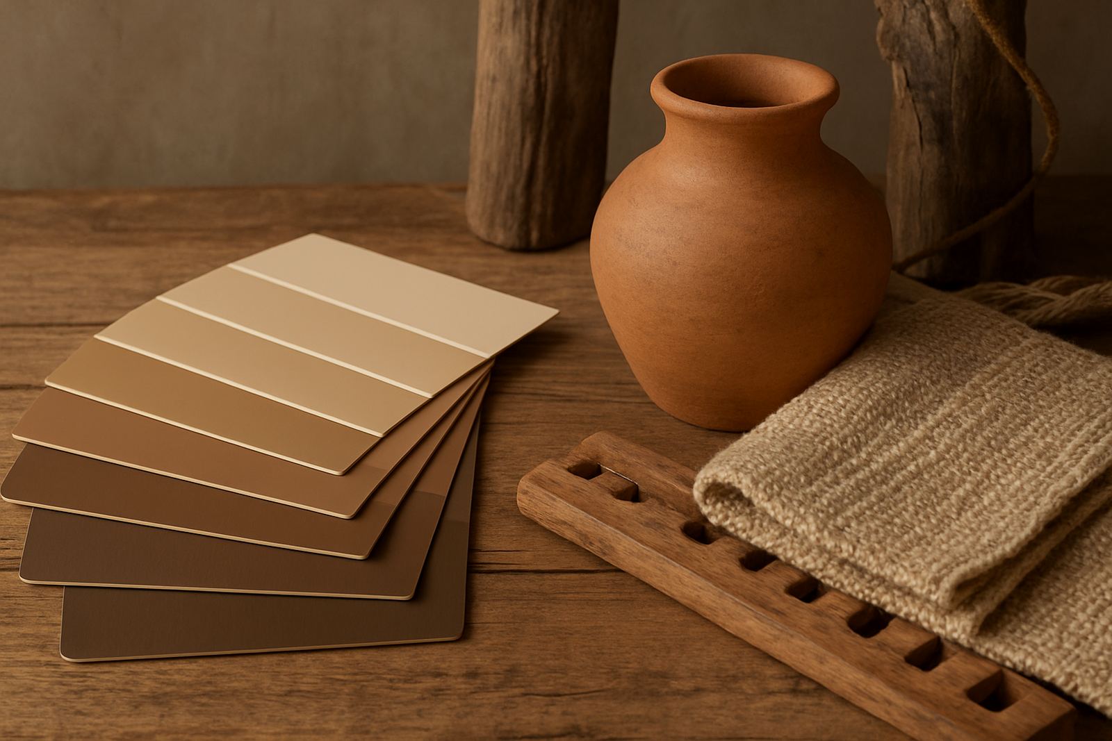
Earth tones sit comfortably in our climate because they echo stone, clay, sand and timber. In Gqeberha, for example, the light can be bright and clean by morning, then softer by late afternoon, so colours with a natural base tend to stay pleasant through the day instead of looking too stark or too yellow.
If you are working with open-plan living, earth tones help connect spaces that do different jobs. A warm beige in the lounge, a muted olive in the passage and a clay accent in the dining area can all sit together without shouting for attention. The result feels calm and lived-in, which is often what homeowners want when they are repainting after years of patching and touch ups.
Choosing the right earth tone for your light and surfaces
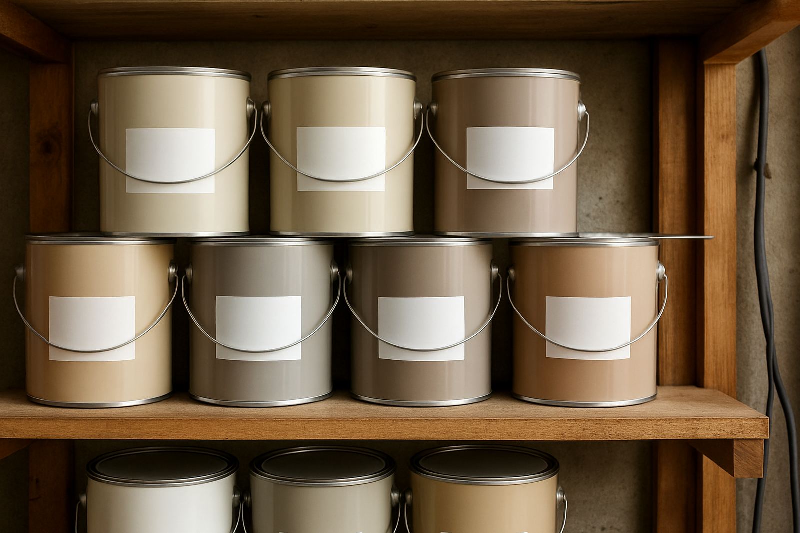
Not every brown, green or beige behaves the same way. A colour that looks soft in a north-facing room may feel flat in a shaded room, and a colour that seems warm on a sample card can turn much darker once it is on a full wall. That is why sample pot mixing and proper colour consultation matter before you commit to 20 litres.
Start by checking the room at different times of day. Look at the colour next to your flooring, curtains, roof overhangs and existing cabinetry. In coastal areas such as Walmer or Bellville, humidity and reflected light can also affect how a paint finish reads, so it helps to test a few options on more than one wall. A small patch near a window and another in a corner will tell you far more than a single swatch on a table.
- Use warm beige or sand for rooms that need more light.
- Choose muted olive, khaki or sage if you want a grounded look with a bit of colour.
- Pick terracotta, clay or rust as accents, not on every wall.
- For darker rooms, lean toward lighter taupe or mushroom rather than deep brown.
Building a palette that feels balanced, not muddy
The trick with earth tones is to keep the undertones consistent. If your main wall colour is a warm taupe, then trim colours, fabrics and wood finishes should support that warmth. Mixing too many competing undertones can make a room look patchy and unplanned. That is often where repaint jobs start to feel harder than they should.
Use one main neutral, one supporting colour and one stronger accent. For instance, a living room can use warm off-white on the bulk of the walls, a dusty olive on one feature wall and natural timber tones in the furniture. This gives you depth without clutter. If the room has a lot of dark metal, stone or tiled surfaces, add lighter earth tones to keep it from feeling closed in.
- Main colour: light taupe, sand or stone.
- Supporting colour: olive, putty or muted green-grey.
- Accent colour: clay, ochre or deep brown.
- Finish: matt for low traffic walls, eggshell or washable sheen for busier areas.
Practical finishes for family homes, rentals and offices
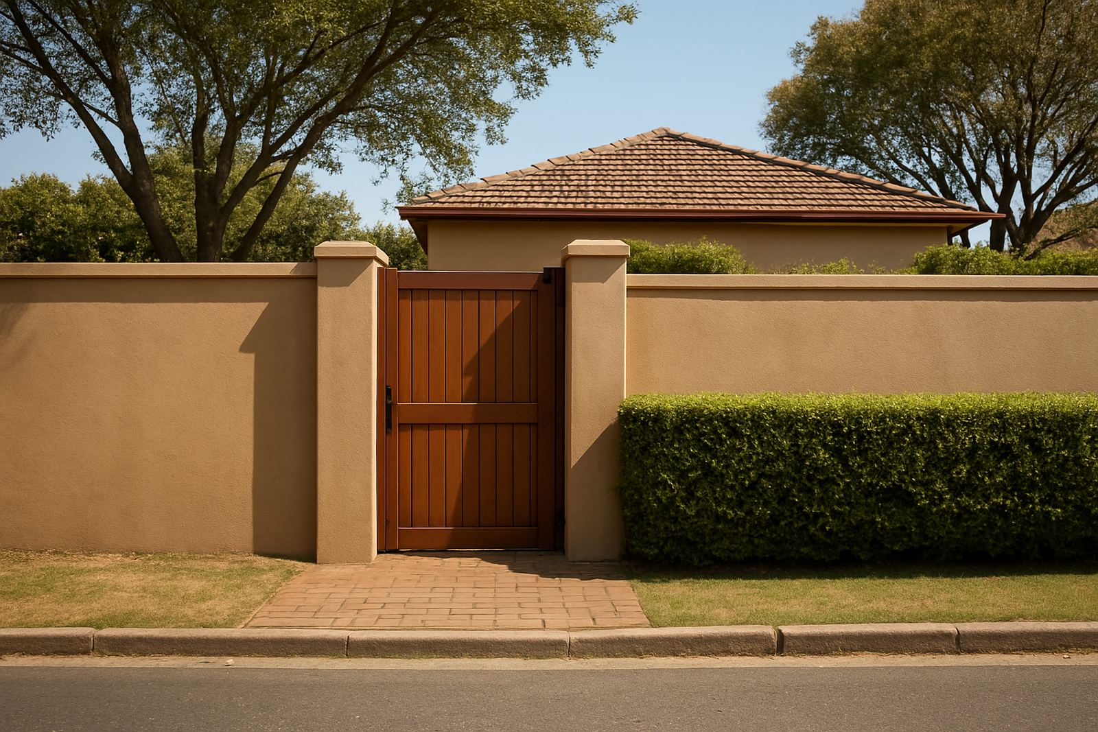
Earth tones need the right finish to perform well. In family homes, especially where children, pets or high traffic are part of daily life, a washable interior paint makes cleaning easier. In rentals and offices, a finish that hides minor wall marks can save time between tenants or after busy trading periods. For exterior areas, choose a product suited to sun, salt air and rain exposure, particularly in coastal suburbs.
Load-shedding also changes how rooms are used. A warm earth-toned wall can make a space feel less harsh when lighting is limited and only a few lamps are running. In a home office or salon, this matters more than people think. If you are repainting a work area in Sandton or Newton Park, test the colour under both daylight and artificial light before placing a larger order. Small changes in bulb temperature can alter the whole mood.
A Gqeberha example: warm calm for a busy family home
A typical Korsten project might start with a family wanting to refresh a lounge, passage and small study without making the house feel darker. A good plan could be a soft sand colour on the main walls, a muted olive in the study and a clay-toned feature wall behind a bookshelf or dining set. The lighter base keeps the home open, while the deeper tones add character.
For a coastal home, prep matters just as much as colour. Walls near windows may need extra attention where old plaster has hairline cracks or where moisture has caused slight bubbling. Before painting, clean the surface properly, fill defects, sand smooth and prime where needed. That extra work saves money later because the finish lasts longer and the colour comes out even.
When you are matching new paint to existing trims or touch ups, bring a sample to be checked in the branch. That is especially useful if the home was painted years ago and the old stock is no longer available. A proper match can save you from repainting an entire room when only one section needs attention.
How decorator supplies support a better result
Good colour is only part of the job. The tools and prep materials you use will change how the final coat looks and how long it lasts. Rollers, tape, fillers, sandpaper, drop cloths and primers all play a part, whether you are doing one bedroom or a full repaint for a contractor account. If the surface is uneven, the best colour in the world will still show faults.
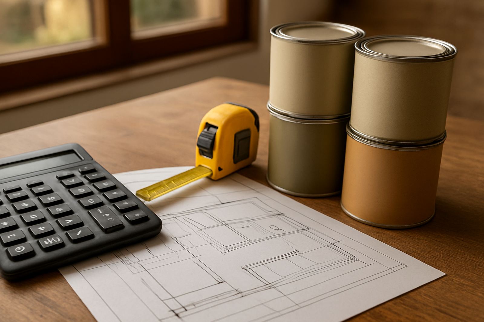
For larger orders, it helps to plan quantity properly so you do not run short halfway through a job. Different rooms need different coverage, and darker colours may need extra coats. Trade order support can help with bulk quantity planning, repaint troubleshooting and product recommendations, which is useful when you are managing multiple units or working to a deadline.
- Check wall condition before buying topcoat paint.
- Buy enough primer where stains or patching are present.
- Keep extra touch-up paint for future maintenance.
- Match tools to the finish you want, not just the price.
Getting earthy colour right from sample to final coat
Earth tones reward careful testing. A small pot can look almost perfect in the shop, then shift once it is rolled onto a whole wall. That is normal, and it is why sample pot mixing and colour consultation are worth the effort. The goal is not only to like the colour in isolation, but to see it working with your flooring, furniture and light.
If you are unsure, start with the area that will be seen first when someone walks in. In a home that might be the entrance wall or living room. In a business it could be the reception, waiting area or boardroom. Once that anchor colour is right, the rest of the palette becomes much easier to manage. Earth tones are at their best when they feel settled and practical, not trendy or forced.
From Korsten to Walmer, and from Randburg to Bellville, the same rule applies: test properly, prep well and choose colours that suit the space you actually live or work in. That is how you get warmth without clutter, and a room that still feels right after the furniture moves back in.