
Start With One Colour Story Across the House
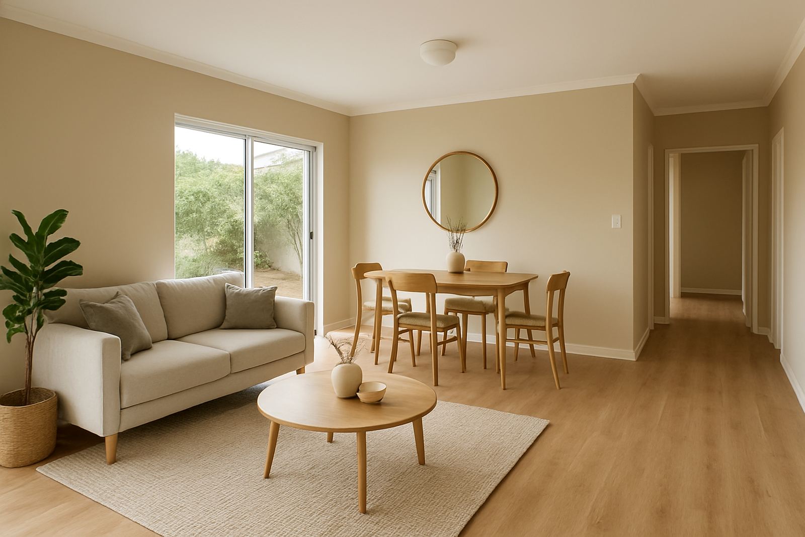
A good colour flow begins with one simple question: how do the rooms relate to each other? In many South African homes, the lounge, passage and dining area sit close together, so a strong idea in one room can affect the rest of the house. That does not mean every wall must match. It means the colours need a shared base, such as the same undertone, the same softness level or a repeated accent colour used in small doses.
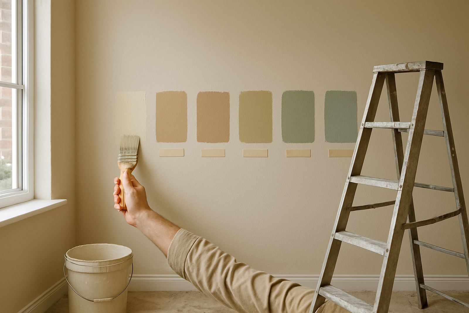
In Gqeberha, light can shift quickly through the day. Morning sun may make a pale cream look warmer, while late afternoon light off the coast can cool it down. That is why testing a few sample pots on more than one wall is worth the time. Look at the colour in shade, direct light and at night under your indoor fittings. A colour that works in Walmer may read very differently in a north facing passage in Korsten.
When planning the flow, think from the entrance inward. The first visible room sets the tone. If that space is calm and neutral, the next room can carry a slightly deeper shade without feeling abrupt. If the first room already has strong colour, the adjoining room should usually soften the step rather than fight it.
- Use one base family across connected rooms, such as warm neutrals, muted greys or soft greens.
- Repeat one colour element in trim, feature walls or painted joinery.
- Keep sheen levels consistent where possible so the finish feels steady from room to room.
Use Undertones to Make Different Colours Sit Together
Two colours can look close on a sample card but clash badly on the wall because their undertones are different. A beige with pink in it will sit awkwardly beside a beige with yellow in it, especially in open plan spaces. The safest route is to match the undertone before you match the shade. This is where colour matching and proper consultation save time and paint.
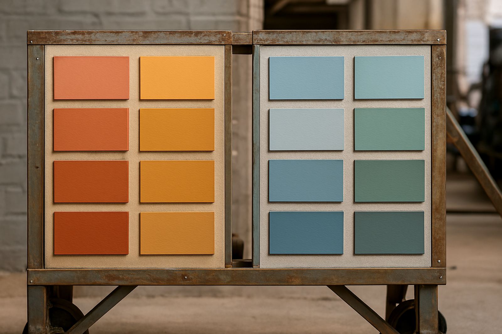
For example, if your passage is a soft greige and the lounge needs more character, choose a deeper colour with the same grey base. A sage green with a blue undertone can link neatly to a cooler neutral, while an earthy olive works better beside warmer stones and timber tones. The eye reads these relationships as intentional, even when the rooms are not identical.
At ColouRight Paints, this is where sample pot mixing and colour matching make a real difference. A tiny shift in tint can change how a room feels once the sun and lamps hit it. That matters in homes, offices and shops where one bad match can make the whole stretch of wall look patched or unfinished.
- Check whether the colour leans warm or cool before you buy the full quantity.
- Hold samples against skirting, tiles and cupboards, not only against white paper.
- Use the same undertone in adjoining rooms, even if the depth of colour changes.
Let Light, Size and Ceiling Height Guide the Transition
Colour flow is not only about matching shades. It is also about how a room behaves. Smaller rooms often need lighter colours to avoid feeling boxed in, while larger spaces can carry more depth on the walls. A low ceiling may benefit from a slightly lighter tone than the walls, while a tall room can take a stronger contrast without feeling heavy.
In a Gqeberha home with an open lounge leading into a hallway, the passage can act as a bridge. That bridge should be quiet and deliberate. A pale neutral in the passage can connect a bolder family room to a more restful bedroom zone. In Sandton Joburg, where apartments often have tighter sightlines, this approach helps a compact space feel ordered rather than chopped up.
Colour also needs to respect the finish on other surfaces. Shiny tiles, granite counters, varnished timber and aluminium windows all reflect light in different ways. If a room has a lot of hard surfaces, a softer wall colour usually calms the overall feel. If the room is full of fabric and matte finishes, you may need a bit more colour on the walls to stop it from looking flat.
- Use lighter tones in narrow passages and darker tones in larger destination rooms.
- Balance strong sunlight with softer wall colours to prevent glare.
- Coordinate wall paint with floors, cupboards and door frames before making the final choice.
Create Transition Points Instead of Sudden Jumps
The best painted homes rarely jump from one colour to another without a reason. They use transition points. A transition point can be a passage, a doorway, a staircase landing or even a painted architrave. These are places where the eye can reset before moving into the next room. When used well, they make the whole property feel planned.
One practical method is to keep the common areas neutral and use the private rooms for more personality. Another is to carry a feature colour from one room into the next in smaller ways, such as a reading nook, a wall behind shelving or the inside face of a doorway. That gives continuity without making every room identical.
This approach works well for repaint projects too. If a client is not changing all the rooms at once, start with the areas that connect the most spaces. A fresh neutral in the hallway can support older colours in the bedrooms until the next phase. It is a simple way to keep the house looking tidy, especially if the repaint has to fit around school terms, business hours or load-shedding schedules.
- Use hallways and landings as calm linking spaces.
- Repeat one stronger colour in smaller features rather than full walls.
- Plan repaint stages so unfinished rooms do not interrupt the overall look.
Match Paint Choices to Daily Use, Not Just Style
A colour scheme has to live well, not just photograph well. Family rooms, kitchens and business reception areas need washable finishes and colours that do not show every mark. Bedrooms and quiet offices can go softer and less reflective. If the rooms are used differently, the paint flow should still hold together through a common colour base or trim colour.
For shops, contractor offices and customer-facing spaces in places like Newton Park or Bellville, the flow should guide people without distracting them. A reception wall may carry the strongest colour, with the back office stepping down into a lighter tone. That keeps the brand feel present while allowing the space to remain practical. In a home, the same thinking helps with children’s rooms, utility spaces and entertainment areas.
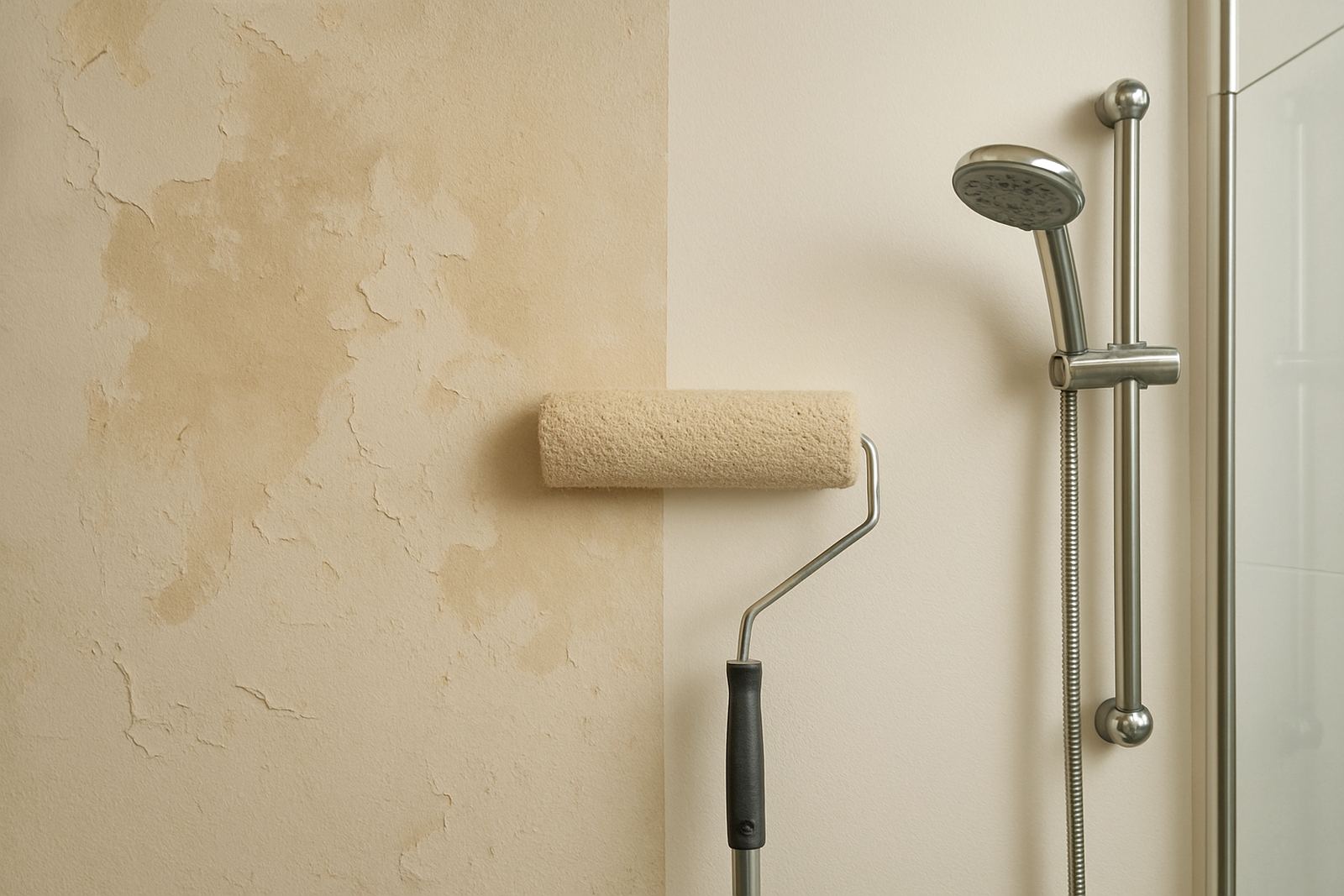
Do not forget surface prep. Uneven plaster, old repair marks and patchy previous coats will break the flow even if the colours are right. Good prep, the right primer and careful repaint troubleshooting are part of the colour plan because they affect how one room meets the next. A clean finish helps the eye move smoothly, and that is what makes colour flow feel intentional.
- Choose washable finishes for high traffic rooms and lighter sheens where marks are a problem.
- Keep repair work neat because flaws interrupt the colour story.
- Plan room use first, then select colours that support that use.
A Gqeberha Example: From Korsten to Walmer Without a Break
Take a typical home in Gqeberha with a living room, a central passage and three bedrooms. The owner wants the lounge to feel warm for evening use, but the bedrooms must stay calm and cool. A strong terracotta on every wall would be too much. Instead, the flow can start with a soft warm neutral in the lounge, move into a lighter sand tone in the passage and then shift into muted blue grey in the bedrooms. The colours differ, yet the undertones keep them related.
That same thinking helps in mixed-use spaces around Korsten and Walmer, where a front room might double as a home office or receiving area. In that case, the front space can carry a stronger accent colour, while the areas deeper in the house stay quieter. If a business owner is repainting a consulting room in Randburg Service Area or a branch office in Cape Town, the principle stays the same: one clear path from one room to the next, with no harsh break in the middle.
Colour consultation is especially useful when the project includes more than one building or branch. Matching the same colour name is not enough if the wall light and surface are different. The right approach is to test, compare and adjust until the result looks right in each specific space. That is the practical way to get flow that works in real life, not only on a card.