
Start with the room you live in, not the colour card
Most people choose a neutral by holding up a swatch and asking whether it looks clean. That is a start, but it is not enough. A colour that looks soft in a shop can read very pink in a north facing lounge, or turn blue in a bedroom that gets winter shade. In Gqeberha, coastal light and humidity can make pale colours show every small mark, so the wall colour must work with the room as well as the furniture.
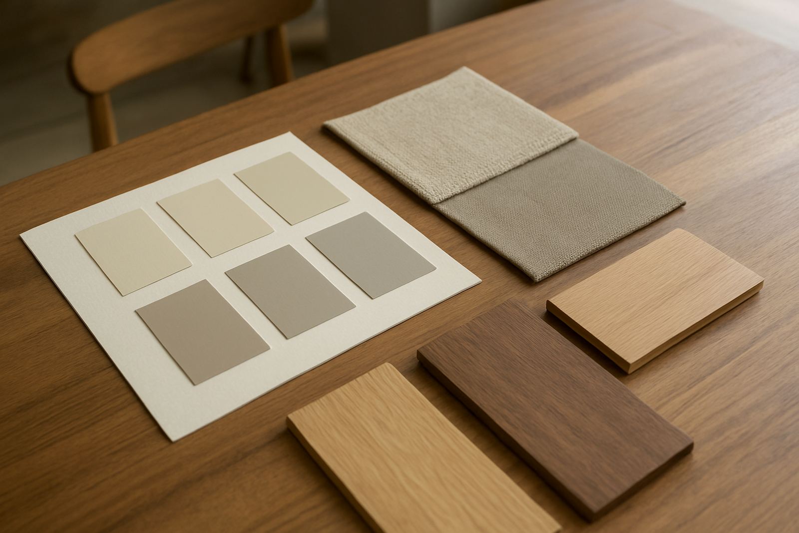
Before choosing a tint, look at three things: the floor colour, the biggest furniture pieces and the amount of natural light. A warm stone beige can sit well with timber, leather and warmer fabrics. A cooler greige may suit modern grey sofas, chrome fittings and lighter floors. If the room is small, the right neutral can open it up, but only if the undertone is calm and consistent.
- Warm neutrals: beige, oatmeal, mushroom and soft taupe.
- Cool neutrals: pale grey, greige, mist and chalky off-white.
- Clean neutrals: bright whites with a slight warm base for softer walls.
Check undertones in morning light and at night
Undertone is what makes one neutral feel inviting and another feel wrong. Two paints can both be called grey, yet one leans green and the other leans purple. If you have mixed lighting, the colour can shift through the day. That is why sample pots are worth the effort. Paint a board or a section of wall at least 600 mm square and watch it in morning sun, midday brightness and evening lamp light.
In many South African homes, especially in rooms that face the afternoon sun, a neutral with too much yellow can look tired by late day. In cooler rooms, a colour with a little warmth helps prevent the space from feeling stark. If you are repainting after years of wear, also check how the old colour affects the new one. A strong red or dark feature wall may need extra coats or a proper base coat, otherwise the finish can look uneven and costly.
- Place samples next to skirting, tiles and curtains, not on their own.
- Test the colour beside the actual white ceiling and trim paint.
- Look at the sample from the doorway, not only up close.
Match the neutral to furniture styles without fighting the room
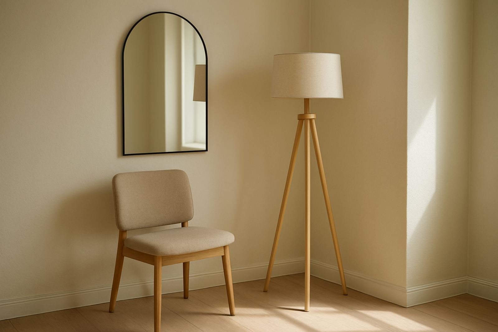
Neutral walls should support the room, not compete with it. If the furniture is traditional with darker wood, a soft warm neutral usually feels more settled. If the room has modern upholstery and sharp lines, a cooler neutral can keep the space neat. For mixed furniture, choose a middle tone that bridges the differences instead of pushing the room too warm or too cold.
It also helps to think about fabric texture. Linen, raw cotton and woven rugs often suit softer neutrals with a little depth. Smooth leather, gloss side tables and polished floors can handle cleaner, clearer tones. If the room already has bold art, patterned cushions or colourful curtains, let the wall colour sit back and do its job quietly. That does not mean plain. It means balanced.
- Dark furniture: warmer off-whites and stone tones.
- Light timber: greige, putty and muted beige.
- Bold decor: quieter neutrals that do not pull attention.
Choose the right neutral for each room size
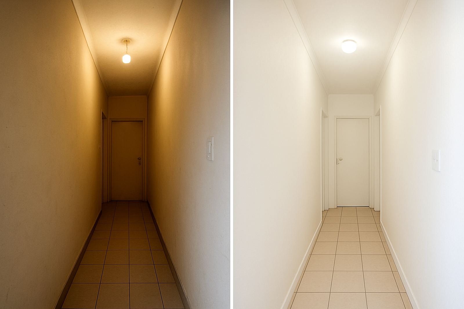
Room size matters, but not in the simple way people think. A small room does not always need the palest possible paint. Sometimes a slightly deeper neutral makes the room feel intentional instead of washed out. In a compact bedroom, a soft taupe can make the wall surfaces feel settled. In a narrow passage, a lighter neutral with enough warmth can help the area feel open without looking clinical.
Large rooms need a bit more consideration. A very pale white in a big lounge with high ceilings can feel empty if there is not enough texture or furniture to hold it. A fuller neutral can make the space feel more lived in. For open plan homes, choose one main neutral that can run from kitchen to living area, then vary with textiles and decor. This keeps the house coherent without looking repetitive.
For homes in places like Walmer or Newton Park, where rooms often catch strong daylight, a middle neutral can be easier to live with than the palest shade on the card. It hides minor scuffs better and copes better with frequent cleaning too, which matters in family homes and rental units.
Sheen and finish matter as much as colour
Even the best neutral can disappoint if the finish is wrong. A flat finish hides small wall imperfections, but it may mark easily in high traffic areas. A higher sheen wipes down more easily, yet it can expose roller marks and patchy plaster. For most living rooms and bedrooms, a washable matt or low sheen finish works well. In kitchens, passage walls and busy family spaces, a more durable finish is usually the better call.
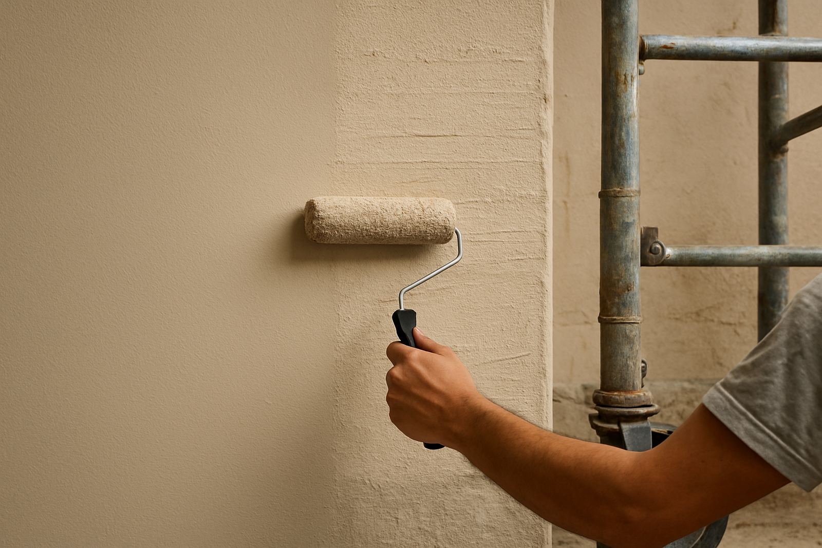
On coastal properties, humidity can affect how paint cures and how long it stays looking fresh. Good surface prep is not optional. Make sure plaster is dry, old chalky paint is sealed and any mould spots are treated before painting. If you skip prep, the colour can look uneven no matter how carefully it was mixed. It is a common mistake and an expensive one.
- Matt finish: soft look, good for most bedrooms and lounges.
- Low sheen: better wipeability for family spaces.
- More durable finishes: useful in kitchens, passages and rental properties.
A Gqeberha example: a family lounge that had to work for everyone
A recent local example shows why neutral choice needs real-world testing. A family in Korsten wanted one wall colour for a lounge used by children, visitors and evening TV time. The room had a dark sofa, pale tiles and a timber dining table nearby. Pure white felt too hard, while a cool grey looked dull in the afternoon. The better answer was a warm greige with a slight stone base. It lifted the room, worked with both the wood and the tiles, and still looked calm under artificial light after sunset.
That same colour would not have worked as well in every home. In Sandton, a room with cooler daylight and glossy floors may need a cleaner neutral. In Bellville, where some homes get softer light and have textured finishes, a beige grey may sit more naturally. The point is to treat neutral as a family of colours, not one safe option for every room.
If you are unsure, ask for colour-matching, sample pot mixing and repaint troubleshooting before you commit. A good neutral is one you can live with in summer heat, winter shade and load-shedding evenings when the only light in the room comes from lamps and phones.
Use a short checklist before you buy the full tins
Once you have narrowed the choice, run through a final check. This saves money and avoids repainting later. It also helps if you are buying for a contractor job or a full home refresh, where different rooms must still sit together.
- Does the undertone suit the floor, furniture and trim?
- Does the colour still look good in morning and evening light?
- Will the finish handle cleaning, moisture and daily wear?
- Do you need one neutral for several rooms, or a different tint per room?
- Have you tested the colour on the actual wall surface?
When in doubt, buy a sample first. One small test can save several litres of paint and a lot of frustration. Neutral walls are meant to make life easier, not create a new problem every time the light changes.