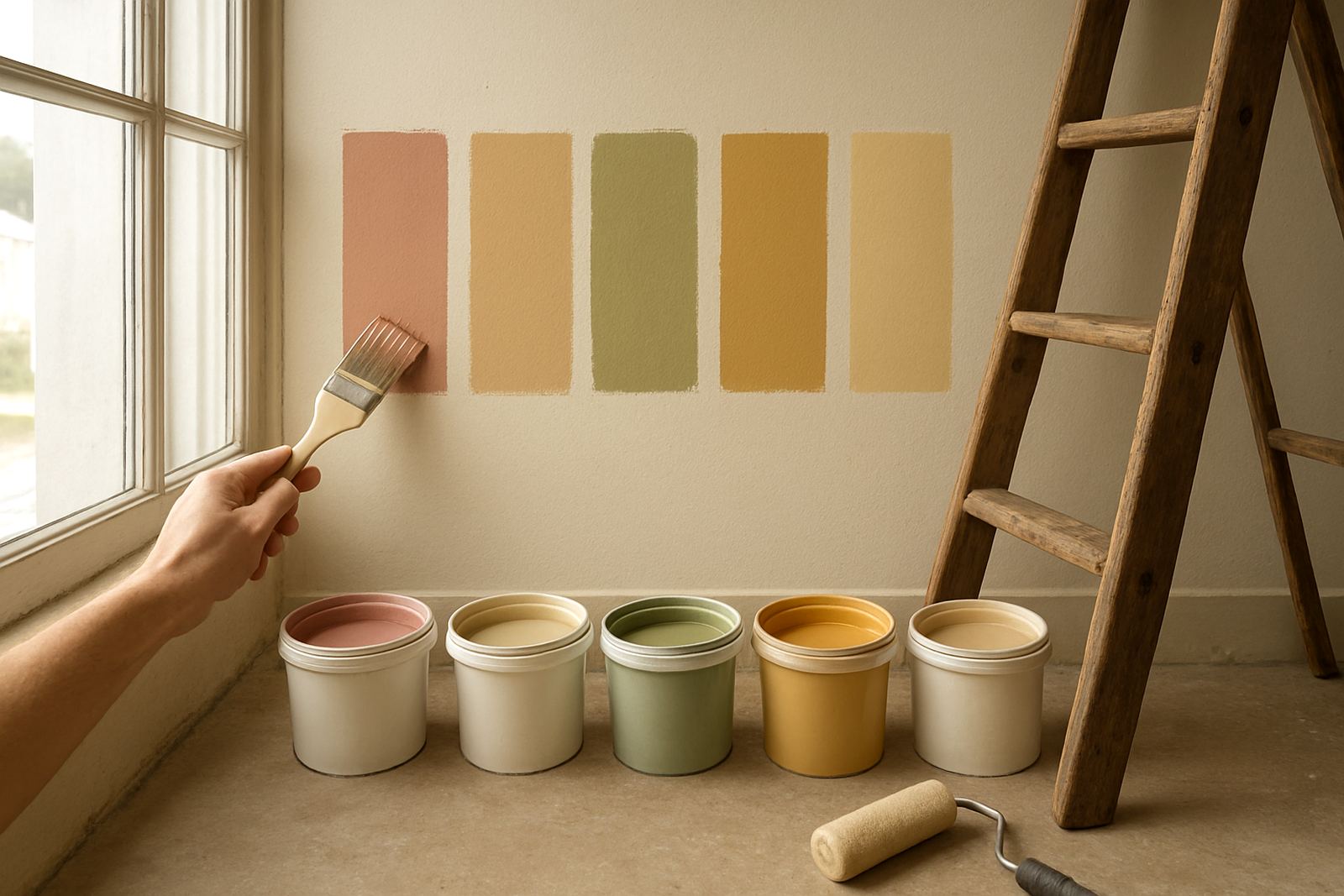


What Colour Cards Are Used For
Colour cards are printed or coated reference sheets that show a range of shades from one colour family or collection. They make it easier to compare off-white, beige, grey, earth tones and stronger statement colours before any tinting takes place. In a place like Gqeberha, where sea air, sun exposure and changing light can shift how paint looks on the wall, a card gives you a practical starting point.
At ColouRight Paints in Korsten, colour cards are often used during colour consultation, sample pot mixing and repaint planning. They help you avoid the common problem of choosing a colour from a tiny online image or a badly lit showroom sample. You can hold the card against your flooring, tiles, roof colour or existing wall finish and see if the shade still works in real daylight.
Sizes, Formats and Colour Range Options
Colour cards are available in different formats depending on the range you want to compare and how many shades you need to review. Some are single-strip cards with a few related tones, while others show a wider family of colours for bigger selection work. For trade buyers and decorators, the useful part is having a clear reference that can be carried to site, a showroom or a client meeting.
- Single-family cards for one colour group, such as neutrals or blues
- Multi-shade cards for comparing lighter and darker tones side by side
- Sample-friendly cards for choosing a tint before mixing a trial pot
- Trade selection cards for contractor quotes and bulk planning
Where needed, the team can help you line up the card against a wall section and talk through undertones, gloss level and finish. That matters when you are working on a flat, a sectional title unit, a shopfront or a rental property that needs a quick refresh.
Where Colour Cards Work Best
Colour cards suit almost any project where you want a better result before you buy paint. They are especially useful for interior repainting, exterior refreshes, new build selections and office fit-outs. If you are choosing between shades for a kitchen, passage, bedroom, boundary wall or reception area, a card makes the decision faster and less costly.
They are also handy for contractor account holders who need to show options to clients on-site. In Joburg areas like Sandton and Randburg, and in Cape Town areas like Bellville, clients often want a neat shortlist instead of a long wall of options. Colour cards help with that. They are also practical for Walmer, Newton Park and the Korsten service area where quick turnarounds are often needed.
- Homes needing a repaint after sun fade or coastal weathering
- Commercial premises needing a uniform colour across rooms
- Rental units where colour consistency matters across units
- Trade jobs where client sign-off is needed before mixing
How to Use Colour Cards Before Mixing
Start by looking at the card in natural light, then check it again indoors under your normal lighting. A colour can look warmer, cooler or darker depending on the room, the time of day and the surface under it. If you are matching to an existing wall, compare the card next to a clean, dry section rather than a dusty or stained patch.
If you are planning a full repaint, keep in mind the finish as well as the colour. A matt surface hides minor wall marks better, while a sheen finish is easier to wipe down in some areas. For homes near the coast, or businesses with more traffic, the right finish can matter just as much as the shade. Ask for surface prep advice if you are unsure, because a good card choice can still look wrong on a badly prepared wall.
For sample pot mixing, a colour card is the quickest way to narrow the field before ordering trial quantities. That saves time and helps cut waste, especially when the job needs to be done around load shedding schedules or in a narrow maintenance window.
Ordering Checks for Builders, Homeowners and Contractors
When ordering colour cards, make sure you know which colour family you want, how many shades you need to compare, and whether the selection is for interior or exterior use. If you are working from a client brief, bring the floor, tile, fabric or cabinet reference with you if possible. Small details can shift the whole result.
- Confirm the intended room or exterior area
- Check whether you need a matt, eggshell or higher sheen reference
- Ask if you need a full family card or a small comparison set
- Bring old paint chips or a sample for colour matching support
- Plan extra time for bulk quantity planning on larger jobs
Trade clients often prefer to order cards alongside tinting, product recommendations and contractor account help in one visit. That keeps the colour choice, price and quantity aligned before the paint order goes through.
Care, Storage and Reuse on Site
Colour cards last longer if you keep them clean, flat and away from direct sun. Avoid folding them, marking them with a pen or leaving them in the car where heat can warp the paper. On site, store them in a folder or sample file so the shades stay readable for future jobs.
If a card gets dusty, wipe it gently with a dry soft cloth. Do not wet it unless the product notes allow it. A damaged card can lead to poor colour calls later on, which is why many decorators keep one clean master card and a working copy. That small habit saves trouble when you are matching again weeks later.
For repeat work in humid coastal areas, it helps to revisit the card before every new batch of paint. Light changes, substrate changes and ageing paint can shift the final result a bit, so a quick re-check is worth it.
Key facts
| Product type | Colour reference cards for paint selection and comparison |
|---|---|
| Use | Interior and exterior colour narrowing before mixing or purchase |
| Best for | Homes, contractors, retailers and commercial repaint projects |
| Options | Single-family cards, multi-shade cards and sample selection formats |
| Support | Colour matching, sample pot mixing, consultation and order guidance |
| Power or gas needs | None required |